Tag Archive for: silkscreen

Making your Logo POP on Tee-shirts

Whenever quoting a new job, I always ask to see what they have done in the past. I love improving the quality and service over earlier orders. In addition to being one of the best ways to retain business, I am hard-wired to provide high quality and service. I couldn’t do sloppy work if I tried.

Decorating garments, whether they are silkscreened or embroidered, requires skill and amazing attention to detail.

When a design is silkscreened onto a dark garment, a white layer of ink, called flashing, must be applied first. Flashing makes the colors seem to “pop,” providing better contrast to the shirt.

Because of this extra step, imprinted dark shirts are more expensive than lighter color ones.

I have seen a lot of T-shirts done by other decorators that were not “flashed.” This results in a poor imprint, making it look like the color of the shirt is “bleeding” through the design.

When you are comparing quotes for imprinted garments, it is a good idea to ask to see samples of their work. It may be tempting to shop for the lowest price, though you may be sacrificing quality to save a few pennies.

Not all T-shirts are created equal

Sometimes people are inclined to shop by price alone. This is especially true for T-shirts. People think it’s just a T-shirt, how can they be any different?

They can be different in many ways: the fabric may be made from 100% cotton or a 50/50 blend, or moisture-wicking material. And the weight of the fabric may range from 4.0 ounces to 6.1 ounces.

Another thing to consider when you are getting a quote is the quality of the imprint.

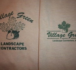
Prior to working with us, Village Green used a prominent local silkscreener with almost 35 years experience. They printed the T-shirt on the left, which has numerous problems:

  • the overall logo is too large, giving more prominence to the acorn and leaves than to the company name;
  • the attempt to give “Village Green” an arced effect doesn’t work. Because letters in script typefaces are connected at the baseline, you can’t arc them. Putting the two words of different size on different slants looks awkward and off-center;
  • the cap of the acorn looks like a blob of ink.

I knew that I could improve In creating a new logo (on the right) our designer:

  • kept the script type all on one line;
  • reduced the size of the acorn and leaves;
  • added fine detail to the acorn cap and leaves.

You will notice that in addition to being a more attractive design, the print quality of the one on the right is superior. Even though the new acorn and leaves are less than half the size of the previous one, the detailed printing gives it a more professional look.

Village Green Landscape Contractors provide high-end, professional work. The new shirts are more reflective of the quality they provide.

 “I love the new logo and also love working with Jeanie. I can always expect creative, quality work,” says Susan Vaille, president of Village Green Landscape Contractors, Inc. “She really helps to present a good image for your company. I know who to call to get it done properly. Thanks Jeanie!”

If you want Jeanie Communications to help you look good, call or email today.